Ok . . . enough of my ad talk! I know what you all really want! The FREEBIE!! The new one is a kit called "Oh So Happy". 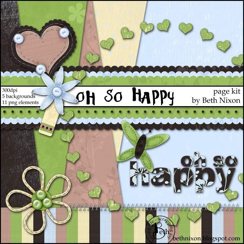
Enjoy!! And as always, let me know if you like it and post any links to layouts you create!!
Ok . . . enough of my ad talk! I know what you all really want! The FREEBIE!! The new one is a kit called "Oh So Happy".
Enjoy!! And as always, let me know if you like it and post any links to layouts you create!!
Blogs. Good golly there are a lot of them out there. And A LOT that I love to read when ever they update. But, it can be overwhelming trying to keep up. I was bookmarking and checking on them every few days but then I would miss things or waste time looking at blogs that haven't updated.
And for us beginners, trying to figure this all out can be overwhelming. So, I thought I'd put together a little something to you started on keeping up with them all!
Many of you are expert bloggers. And you understand this all much better than me. But if you are new to trying to keep up with them and want to start following more blogs (like mine! LOL), then you need a reader!!
I use google reader. I switched to igoogle.com as my home page and life has never been easier. You can add widgets for your email, a reader to update you with all those blogs, a calendar, to do list, weather and so much more!
But we're all about the blog right now. For me, http://reader.google.com is the way to go. Sign up. Then you'll see a link that says "Add Subscription". Add the blog you want to follow, let's say mine, http://bethnixon.blogspot.com/, and every time I update, it'll show up in your reader! You won't have to check your bookmarks or remember to check them at all. The reader does it all for you.
Plus it's concise. I subscribe to about 50 blogs. It takes me minutes a day to go through the ones that have updated! And I don't miss a thing.
Some of my favorite blogs are:
http://thepioneerwoman.com/
She's funny, sweet, has GREAT give aways, and even better photos!
http://digital-photography-school.com/blog/
Always something new to learn about digital photography!
http://photoshopdisasters.blogspot.com/
Seeing these photoshop disasters doesn't get much funnier!
http://qw88nb88.wordpress.com/
Andrea's Buzzing About . . . she's just smart and funny. I've garnered great insight on how to think about my son as we go through the process of trying to help him.
But why even blog or subscribe to someone else's blog?? You know, that confused me for a long time. I'm still figuring out facebook (add me if you're on!) but blogging is, for me, about connecting. I share my little stories and thoughts. And the comments of people sharing my pain, my laughter, my joy. It's a way of connecting. Of us all putting on our sparkly shoes and sharing the joy of life. At least that's why I enjoy them!
Why do you blog? What makes you read someone else's blog? What are your favorite blogs? Tell me all about what you love!
-----------Ok, ok. Enough about me and my sparkly attitude. I know what you all really want . . . the digital scrapbook freebie!! This kit was inspired by my son. Just outside playing and picking some pretty weeds to give to me. Just an everyday moment. The kind that brings you joy. And the kind I never want to forget!
Here's the DOWNLOAD LINK. And please, leave me a comment here if you you like it or use it. I'd love to see what you all do with it. For credit, if you post a layout somewhere:
Ordinary Joy by Beth Nixon from her blog (and post the address, http://bethnixon.blogspot.com, if allowed).
Here's a look at the kit in action with a layout featuring little boy.
And, please, feel free to pass along the link to my blog to who ever might be interested. And if you have a blog, I'd love if you'd link my blog up in your blog. And show me! I'll be sure to check out your blog too!!
Enjoy!

Ok, I promised this yesterday and I've finally found a few minutes to get it up for you all!
This is the first page kit in quite a while and one created just because! You can DOWNLOAD IT HERE!
And, please, feel free to point friends to my blog to pick it up! And, if you create a layout, please leave me a comment with a link so I can check it out!!
Most of all . . . have fun with it! Scrap something happy! Scrap something just to make yourself smile! Scrap a moment that will make you giggle 10 years from now! Enjoy!
I can't wait to see what you all come up with! Enjoy the freebie!!
credits if you post a layout anywhere:
Love Life by Beth Nixon available on her blog (and post the address if allowed: http://bethnixon.blogspot.com/)
Thanks!
P.S. Be sure to check back often!! I have a new freebie in the works that I hope to post soon!This time we're talking about focal points. 
Simply put, divide your layout into thirds both vertically and horizontally. Where those lines intersect (at the red dots) those are your focal points. Those are where the eyes naturally rest. When you are placing the focal point of your layout, remember those dots.
And yes, with a few exceptions, every layout *should* have a focal point. That focal point should be bigger than everything else, it should jump and yell "LOOK AT ME". It could be the title, an embellishment, the journaling. But, most often, it's one of your photos. So, should you center your photo right on those focal points?? Nope! Center the focal point of your focal point on them!! Did you get that?? LOL
If it's a close-up of your darling granddaughter, make sure her eyes are near that point. Is it a photo of your husband holding your baby boy's hand? Put those hands on one of those red dots!
Let's touch VERY quickly on flow. The natural way your eye flows through a layout is that dotted line in my sample. Starts at the top left and Z's through to the bottom right. Flowing through each of those dots. That's key when you are placing elements. You can use those elements to enhance the natural way our eyes go through a layout. Have the help the viewer go to the focal point.
And hey, have you every noticed those fantastic negative space layouts? The ones with a cluster of elements and lots of empty space. Did you ever notice that *most* of them tend to weight to the bottom right? Well, that's because of flow. Your eye ends up there. I've tried to do layouts that aren't there and they always feel off to me. Why? Because that's they way the eye flows!
Now, when I first started reading all these "design rules" I started to feel overwhelmed. I started to think too much. But, these things are what your eye does naturally!! It's just understanding that. So, when you are designing your layout, if your fussing with it and it feels off, remember these natural design rules! It just may help you fuss that layout to a composition that makes you happy!!
And, again, I would highly recommend the Non-Designer's Design Book by Robin Williams. Although she doesn't talk about Focal Points, she touches on so many other areas that really make you realize how to put together all the basic thoughts on design together in a pleasing way!
Below is a mini-tutorial I put together about shadows. Different shadows will give you very different looks. This will give you the info to follow *your* muse and make those shadows speak! Use it as you'd like.
Ok . . . let's talk about shadows! They are a huge part of digital scrapbooking . . . dare I say essential! For any layout that is striving to show depth, layers, texture, then you NEED shadowing. Many elements come with small shadows already applied. Why? Well, when I'm creating let's say a bead, the light source needs to be there. The gleam on the bead is essential to making it look real. An element without a shadow simply doesn't look right. It's not complete. Light source is assumed when I create each and every piece. I think about how the light will hit a piece of paper, a ribbon, a piece of yarn. Then I do my best to create that digitally so everything will be realistic. From the texture, to the gleam on a metal brad, to the shadow.

And if shadows are so important in creating a kit, they are just as important in creating a layout. Let's take a look at four ways an element might look. The first example above is the out-of-the-box shadow. Just as it comes when you download the kit. It's small. Barely there. Perfect for adding to your layout without further adjustment necessary. AND, small enough that you can add your own shadow and give it an extra kick. Pop it off the page more, even rotate and still keep the shadow direction looking realistic. So, the second example is an average shadow setting that I use in a layout. (Photoshop settings: distance, 2; size 3; opacity 55)
As you can see it gives it just a little extra. Nothing major but I can rotate the item and keep everything looking great. But, note: on backgrounds, when I'm creating I do keep the light source in mind but rotating isn't going to change things much. With a bead or a metal object, or even a ribbon, the light source is MUCH more important. It just can't be rotated without thought. If you flip a bead upside down, not paying attention to the shadow, it's going to look strange. The little gleam might be on the bottom. Opposite of the rest of your layout's perceived light source. There is a way to change the rotation of these items. Just pay attention to the shadow. I've found with a horizontal string of beads, if I rotate anywhere to 90 degrees counterclockwise, the shadow still looks realistic and the gleam still works. That's enough play, if you are creative, to position anything just the way you want!
When I created these flowers, I had in mind those glue pop dots that give LOTS of height to an element. Lots! Take a look at the EXTREME shadow I applied to the third example. (Photoshop settings: distance, 17; size 21; opacity 70) That's A LOT of shadow! It really pops clear off the page. And to give it a bit more realism, I put the shadow on it's own layer and warped it just a bit. If an element is that high off the page, it usually isn't completely flat and straight. So by warping it just a bit, it looks even more real. But that's only for paper-style layouts or placement of paper-style elements. What if you want to add a graphic touch? Well, in the fourth example I got a little creative. I selected the flower, made the selection just a pixel of two less, feathered a bit, reversed and deleted. That got rid of the shadow and made the flower blend a bit into the background. Then I tried a few blending modes, lowered the opacity, and viola', it's no longer a paper-style element but a beautiful graphic element. You could layer it on another background, a photo, etc. It becomes PART of the page not something added on top.
SO, one element with a standard shadow. The options on what you want it to look like are really up to you!! You can take it as it is, add a bit to up the realism, go extreme, or go totally graphic! Fantastic versatility for your layouts! You can change the look with just a few clicks! Think of how you can create new looks *just* by changing the shadow!
Repetition: The act of repeating; a doing or saying again; iteration
As I was researching and putting together this tutorial, I realized that by repeating items or shapes in a layout it unifies a layout . . . emphasizes our theme. And second, it ties together the other concepts we’ve looked at as well! Contrast and Alignment come into play when we talk about repetition!
Repetition . . . . we love knowing what’s coming next. Sure, we all love surprises, but a jarring surprise makes the artistic eye want to go back and explore what’s different. It breaks the flow. (important point here . . . if you are going to break the rule of repetition, make sure the jarring interruption is your focal point!)
The repetition in the layout can be photo series, a shape, element choices, and even words. When you are putting together your layout and it doesn’t feel like it flows, like it fits together, look at the shape of your pieces. Do they fit together? Are you using angles and circles, or swirls and harsh edges? Are the piece choices scattered? Do they fit the theme of the layout? Do you want edgy and fresh or soft and romantic? Think about the emotion of the shapes you choose size and then repeat those shapes to emphasize the emotion you want.
This sounds complicated. Everything has to be round in a layout?? But think about a romantic layout with flowers . . . aren’t the flowers basically round? Not exactly but pretty much . . . certainly not enough NOT round to be contrast. Rounded corners on your mats would help emphasize the emotion of that shape. Looking for a harder edge? Then try straight edges and angles . . . elements that continue the theme.
Another way to look at it . . . if you’re creating a soft, romantic layout, lots of hard edges might not work as well as rounded corners. Pieces of all kinds of shapes just doesn’t work. (This is where we can remember contrast.) Let’s say you have rounded corners on everything, if you put in your focal point with a square edge, it might help bring more attention to it. So, the repetition of the soft, rounded corners would help emphasize the piece that does NOT have the rounded edge!
I struggled finding bad examples of repetition. It can be a bunch of photos of the same theme that are all different sizes or using lots of different shapes without pulling them together in some cohesive way. Photos that are matted differently. Font work that doesn’t have a point of repetition to pull it together . . . and, remember last challenge, the point of repetition could be that right alignment! That gives our eye a nice repetitive place to look. (see how these all work together!)
Anyway, here are some good examples! I’ve been saving this layout just for this challenge! It’s a perfect example of repetition of photos with the exceptions making great focal points. The3chicken’s fandango's baby he. You can see the nice lines, the repetition of shapes and the great break in the repetition. Just a wonderful composition! This is one of my favorite all-time layouts!

Here’s one by Meg. You can see the repetition of the photos as circles but you can also see the big circle used as a mat. She continues the circle theme and that gives the layout a cohesive feel. She has lots of different photos but they all fit together.

Here’s one by me. Now, I’m not using this one as an example of using lots of photos (as that seems to be the focus of what I’m talking about) but as an example of the repetition of the rounded corner shape. The repetition of the rounded corner is what pulls this layout together that is filled with so many different photos and colors.

Here’s one by Rene' Bross. She noticed the circle in her photo and pulled that shape into the layout beautifully. The circle is repeated through the layout emphasizing that great photo and making it unequivocally the focal point.

Here’s another one of my favorites: vallie’s Witching Hour Magic. There’s a circle feeling all though it. The moon, the framing, even the curve of her head to her arm. It’s very rounded feeling and that makes it feel like it belongs together. The repetition of the shapes, through framing, and the photo make it feel like a piece that belongs together.

Here’s an example of repetition in journaling. It’s not one of my favorite layout designs but I like the journaling! By repeating the phrase “just yesterday” I’m emphasizing the feeling I’m trying to portray. Repetition in journaling can be very catchy, easy to read, and fun.

Here are three more examples of repetition that I found that I thought worked really well. First is Joannknnrd’s enjoy beach girl. It has great gallery appeal. Then two by Ann. Her Shabby Chic layout here has some nice repetition that work well. Here’s another of Ann's, endurance, that I liked. There’s something about the shape and the placement that show’s a strong sense of repetition that ties the layout together.


Now, go see what you can do keeping the concept of repetition in mind! But remember the Golden Rule . . . if you like the layout, LEAVE IT ALONE! If it doesn’t feel right to you, think through the concepts and see if tweaking or adjusting something according to the concepts, will help. And go through your gallery with a new critical eye. Being able to articulate what DOES work and what does NOT work in your own work, will make many of these concepts second nature. Not something that slows down your creative process but enhances it!
(you can click on most of the layouts for full credits)

