Friday, August 29, 2008

Organize, Be GREEN, and a FREEBIE {Summer's End}

{edited to list freebie info only}

Ok . . . last but certainly not least . . . a NEW freebie!! It's a pack of ten beautifully digital backgrounds! I started with four and then just kept going! I certainly hope you all enjoy them!! Leave me a comment if you pick 'em up and a link if you scrap with 'em!!

The backgrounds are called "Summer's End" for no other reason than it was created at the end of the summer!

You can DOWNLOAD 'EM HERE. (link will be good until the end of September)

If you use them, credit Summer's End by Beth Nixon available on her blog (and list my blog address if allowed! http://bethnixon.blogspot.com)

Thanks! And enjoy your weekend!!

Sunday, August 24, 2008

Privacy and a FREEBIE! {Print It Now 3}

{edited to include freebie only}

OK . . . FREEBIE alert!!

Number three in the Print It Now series is here!!

Download the first two in the freebies section then click below to get the latest installment!!

Then skip below to pick up the newest one!

DOWNLOAD HERE. (It'll be here for about a month or so!)

Enjoy your Sunday!

Saturday, August 16, 2008

Swinging {and Black & White and Rainbow-licious FREEBIE}

{edited to include freebie info only}

I have two. Well, one.

No, two!

Confused yet?

It started out as a pure black and white kit inspired by outfits I saw at a recent baby shower. But it needed a pop of color so I added some rainbow gradients and scuffed them all up.

But as I tried to scrap with the kit, I realized that the swirls were too much with the rainbow colors. And making everything rainbow colored made it hard to use. And, just black and white was hard to use as well!

SO, two kits. Essentially the same. One in pure black and white. One with added rainbow sparks added to each piece. That way you have the choice to scrap it black and white, scrap it black and white with pops of rainbow pieces, or go full out color! Your creativity will have no bounds!

Here are the previews of the two kits, It's Black and White and It's Rainbow-licious.

Let me know what you think! Comments are always appreciated. Links to layouts are loved.

And as I plan new things . . . what do you want to see? More kits, frames, or templates; more blather; more tutorials? Let me know!

Ok, enough said . . . here are the links. They should be good to the end of the month or a little longer.

It's Black and White DOWNLOAD HERE

It's Rainbow-licious DOWNLOAD HERE

As always, if posting online, credit Beth Nixon, available on her blog, and link up my blog if allowed: http://bethnixon.blogspot.com

Thanks and ENJOY!!

Monday, August 4, 2008

Bethy's Tutorials: Using Masks for Selective Color

Ever seen those dramatic pictures using selective coloring?  Where only one part of the photograph is in color?  There are several ways, as is always true in Photoshop, to get that effect.  But my favorite way is to use a mask.  I never really understood masks (still don't fully understand all they can do) but it does make for a REALLY easy way to create selective coloring on your photograph!

Not sure what selective coloring is?  The first photo below is full-color.  The one just below it, I converted the photo to black and white and left the rose in full color.  So, let's see one way we can do that!
 

Step 1
Pick the photo you want to play with.  Name it color or whatever works for you!

Step 2
Duplicate the photo.  Convert the one on top to black and white. (and creatively, I named that layer black and white)
(I like the black and white action I downloaded from the
Pioneer Woman's Photography blog.)
 

Step 3
With the top layer (black and white) selected, click on "Add layer mask" (the third icon from the left on the bottom of the layer palette)


Step 4
You can see below that the mask is now added to your black and white photo.  Click on the white box. (the layer mask thumbnail)
(and note, any time you do other things and decide to come back to the mask, be sure to click on that white box, the layer mask thumbnail.  Otherwise you are just activating the layer and not the mask.  What we want, when working with the mask, is to be sure the mask is active.)

Step 5
Select a soft, round brush at a size that works for painting over the area you are working on.

Be sure that you have BLACK as your brush color.

Why black? Because this is how a mask works . . . the mask is on top of your black and white layer. When you paint on your mask with black, it's like erasing the black and white layer and showing what's underneath (the full-color photo in our example).

When you paint on your mask with white, it's like it's restoring the black and white layer as the top layer.

SO . . . black paint, seems to erase the top layer . . . white paint puts it back on.

Step 6
Start painting with that black brush!
No need to be terribly careful.  We can fix that later.  Just brush about and get the area covered.

And check out that white layer thumbnail next to the black and white layer.  See how what I've painted in black, shows up on the thumbnail!

Step 7
Ok, time to fix what I "over-painted".

I just switch to white, and paint over my mistakes.  It's like putting the black and white layer back!

Step 8
Make a mistake? 
See what I did below?  I painted a little too much white and turned the edge of my rose back to black and white. Can you guess what I need to do?

Step 9
Switch back to black and fix it up!

Step 10
Just switch back and forth between black and white while the layer mask thumbnail is activated.

Black will "erase" the black and white layer to show the layer underneath.
White will "restore" the black and white layer to hide the layer underneath.

Zoom in real close to get tiny details. And keep playing until you are happy with the results!


Is this all necessary?

Nope.  I used to do selective coloring by layering a black and white photo over the coloring and actually erasing my black and white photo in selected spots.  BUT, if I make a mistake?  It's harder to fix.  This sort of re-touching is actually fun and not nearly as tedious as it's so easy to fix mistakes!!

Have fun with it . . . and if you do use the tutorial . . . let me see the results!! Leave me a link so I can come ohh and ahh!


Friday, August 1, 2008

Bethy's Tutorials: Frames and Paths in Photoshop {with freebie!}

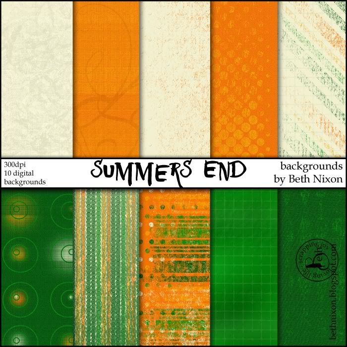
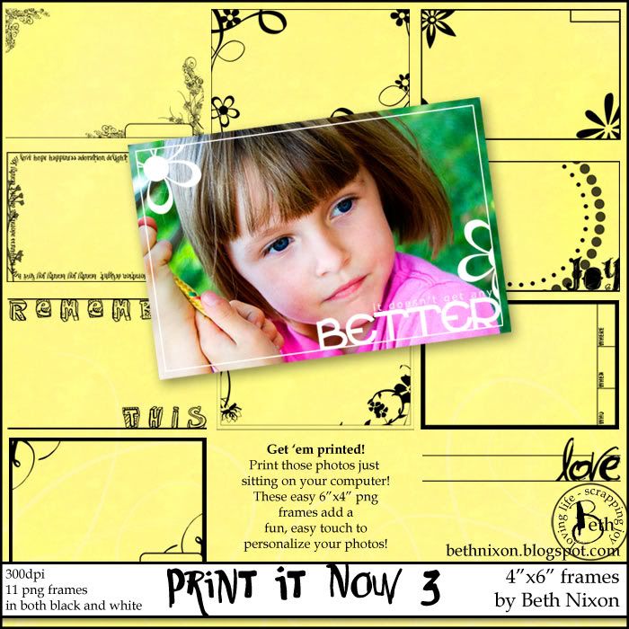
I've had a few questions on how I made the Print it Now freebies. (click for set 1 and set 2) Now, if I was selling these, I'd be embarrassed to tell you how easy they are to make!  I've had so much fun making 'em, I'll probably do at least one more set! But, heck, I'm giving them away so I'll also let you in on how I made them!

A few tips on using paths and you can customize frames for any photo you want!  Just remember, Photoshop is a complex program and there more than likely is 14 different ways to do what I'm going to show you and most definitely an easier way! This is just what I've found works for me.

Ok . . . onto the tutorial.
(remember to click on any image to see it bigger)

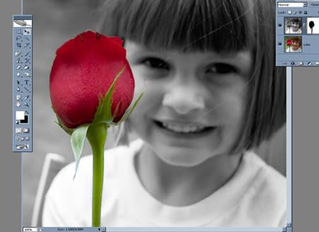
Here's the finished frame (and yes, it's a freebie at the end of the tutorial!)
 

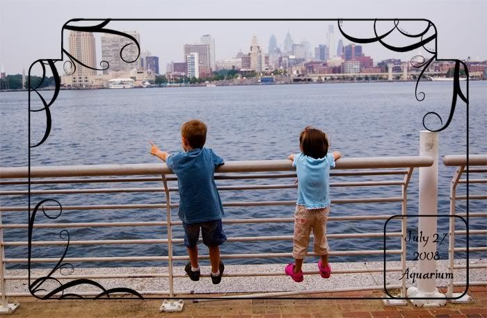
It's my kids overlooking the river and the skyline.  I wanted a frame that would emphasize the skyline a bit so I made one just to fit this photo!

Step 1
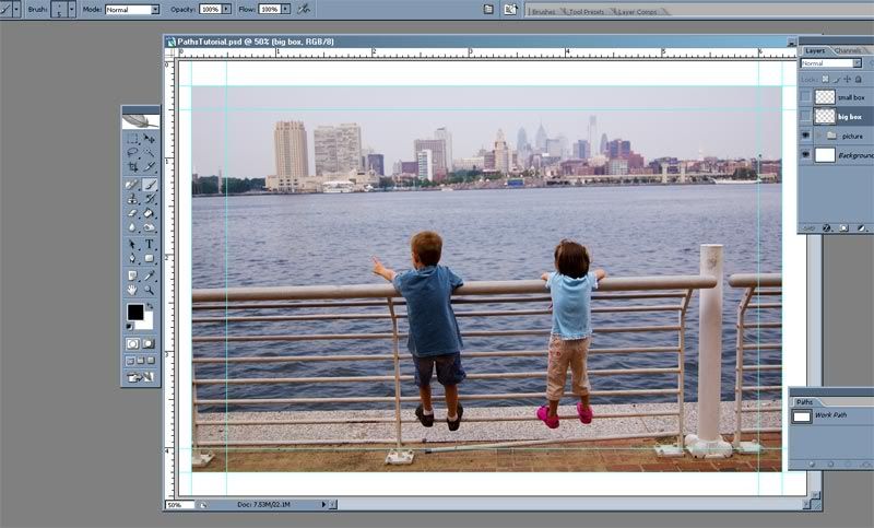
Open up a new document.  I'm making frames for 6"x4" frames so I created a canvas at 6.5"x4.5" and 300dpi.  (why bigger?  just cause I like a little extra room when I'm creating!)

Then I add guidelines.  I marked off the 6"x4" borders and then came in about a quarter inch.  I like to keep a minimum of a quarter inch margin to avoid any printing issues.  That seems to be enough to keep things working.

(and, yes, I just noticed that my example is a bit off as one edge is more of 1/8" and the other is 1/4" but, you get the point, right? I'm usually very tedious with my measurements but I ain't going back to fix all my screen shots now!  So, just pretend that I did it right, kay?)

Step 2
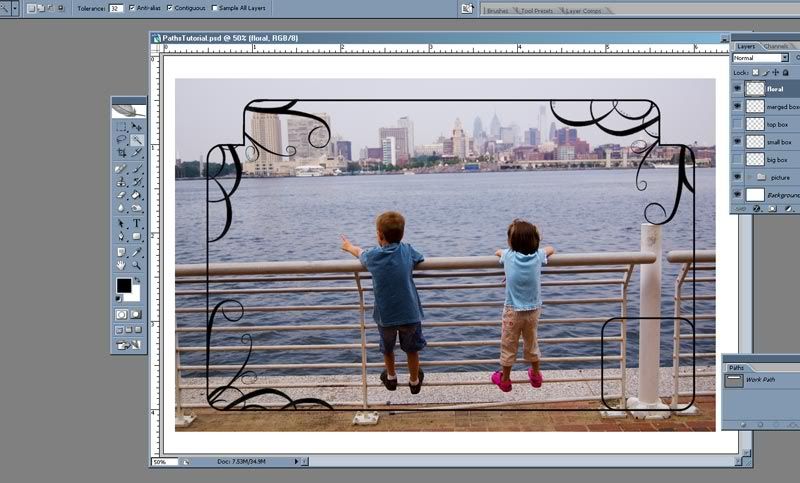
The next step is to draw out a path for the big box of the frame.  You need to have your Paths toolbar open. (Windows > Paths) Then click on your Tools bar and choose the rounded rectangle tool. (that's the bottom arrow) Then look at the top.  Be sure that middle box is selected, Paths. (the top red arrow is pointing to it)

I chose a radius of about 50 pixels. (that's the box to the right of your top red arrow. It determines how round the corners will be.)

Step 3
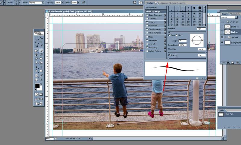
Create a new layer above your picture.  I named it, creatively, big box.  Choose a brush.  I chose a plain black brush at about 5 pixels. (and here's a tip . . . open up the brush palette and make sure the Spacing is at 0%.  For some reason it defaults to something like 25%.  When I draw a line without changing the spacing, it seems a big jaggy.)
 

Step 4
Ok, you have your brush chosen with the color set to black, you are on a new layer above your photo, make sure your path is selected.  (If you can see that path you just created, then it's selected.  If you can't, on the paths tool bar, just click on that layer on the paths toolbar.) You are now ready to draw the first part of the frame. On the path toolbar, at the bottom, second icon is "stroke path with brush".   (see arrow below)

Click it! You should have a line like below.

Step 5
Want more shapes?  Repeat.  And here's a hint.  If you name your layer on the Paths toolbar, you can go back and use it again anytime you want.  If you don't name it, it'll be lost when you click off it.

Let me show you what I mean.  Look at the image just above.  See the Paths toolbar layer? It's called Work Path.  That's just the name given to the current path you are creating and it's temporary.  Unless you click and name it (just like you would a layer on the Layers Palette, it'll be lost when you move on.

And that's sometimes ok!  I didn't care about saving the big one . . . it was already drawn out.  SO, I clicked on the Paths toolbar UNDER the layer.  That deselects that path and lets me create a new one. I created a small square at the bottom right.  Created a new layer. (I like everything I draw on a new layer.) And, just like above, chose a brush and stroked my path.

That give me this:

Step 6
Lather, rinse, and repeat.

I wanted a small box at the top to emphasize the buildings in the skyline.  I just de-selected the current (small box) path by clicking under it on the path toolbar, drew out what I wanted, created a new layer, chose a brush, stroked it, and viola!

Step 7
Erase.

On the long thin box at the top, I erased what was in the big box.  On the big box layer, I erased the line at the top.

Step 8
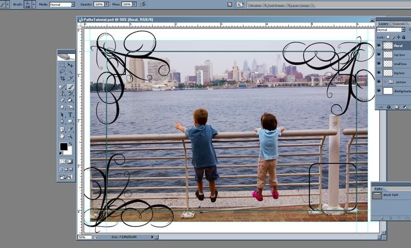
Ok, now I want some pretty swirls.  I have a few brushes from Stephanie Shierdla at Obsidian Dawn. I chose a swirl and, on a new layer, rotated them around and stamped a single swirl in three of the corners.

Step 9
Looking good, eh!  Now, I want to delete the swirls that are outside of the frame.  Problem is that big frame is actually on separate layers. That would make it hard to select and delete the extra swirls.  So I selected the big box and the top box and merged them together to one big box. (Layer > Merge)

Now I can select only the outside of this new big box.

Step 10
Go to the swirl layer and delete!

Now, if you want to save what you've created to use again and again . . . turn off the picture layer AND the background.  You want ONLY the frame lines showing.

Go to File > Save As. Then choose the format to be PNG. Name it and it's there for you to use forever!

That's it!

Yeah, it seems like a lot of steps.  But just run through it once or twice and you'll see how truly easy it is!!

Want the frame I just created?  Well, click HERE!

Enjoy!!