Wednesday, October 22, 2008

Blog Statistics and Internet Privacy/Safety

After this post I wrote about my daughter's picture being found on my blog and posted alongside rather inappropriate pictures, I got a few comments and emails about how I track visitors to my blog.

I use two services.  The first one, and the one I use the most is called BlogPatrol. The reason I like BlogPatrol is because it's live.  The statistics are tracked in real time.  I can follow what pages are being looked at and if a freebie is getting noticed right away.

After signing up, you choose a counter to display on your blog page.  I chose the invisible one which is just a little icon at the bottom right side of my blog. Just that little blue square.

And with that, I can see the information in the graph below. This was this morning.  Before I posted.  It shows me I've had about 20 visitors and with the current rate of traffic, I can expect just shy of 50 of visitors for the day.  It also shows me the last few days.  And it keeps about a month's work of current traffic.  Nothing long term.  It's more of an instant gratification type of info!

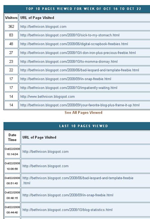
It also shows me the top 10 pages for the week and the last 10 viewed.
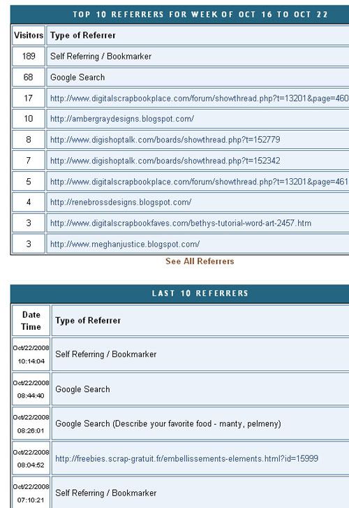
And below is where I found the site that disturbed me so much.  Here I see my top referrers for the week.  If I post a freebie, it's usually blogs such as digifree or ikeagoddess or the3chickens.  If I don't, it's usually people who have me bookmarked or in a reader or such.

The next part is the last 10 referrers.  That's an instant snapshot.  And that's where I had found the offending site the other night.
 

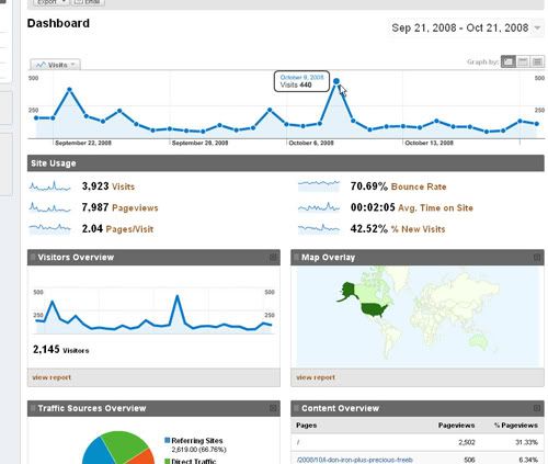
But, what if I hadn't checked right then and it wasn't showing?  Well, I also use Google Analytics.  It's a great site.  LOTS and LOTS of information.  Lots I don't understand how to even interpret.  It collates the data and updates once every 24 hours.  So, although the information is great, for an instant gratification girl like me, I usually check BlogPatrol every day and Google Analytics every few days.

Google Analytics is super clean with fun info. PLUS it keeps the information long term.  Not just a few weeks like BlogPatrol but I can scroll back to when I first started using them to compare stats over time.  This is the home page.  Just hits and page views.
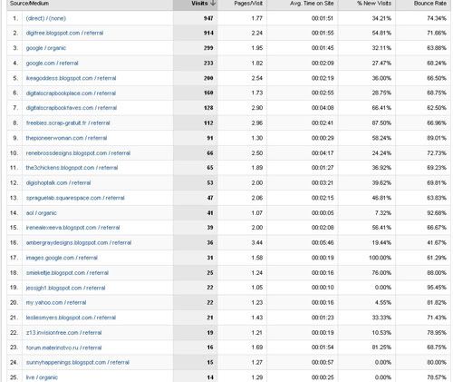
This is one of the reports on referrals. It's very detailed AND it keeps an ongoing record of all sites that have referred me.  I found the "bad" site had sent six hits to my blog.  Now, a few of those were mine as I double-checked things had been deleted.  But it also gives me an overall idea of how people are finding my blog.
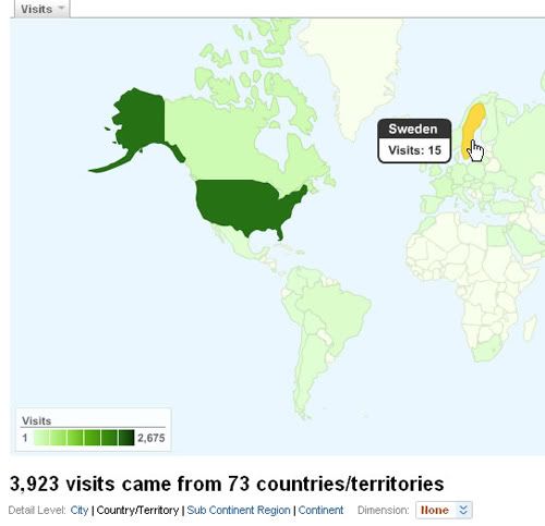
And this is just for fun.  I love looking at this one. Stats for all over the world.  Even 15 hits from Sweden! How cool is that?
The two sites don't always agree with their numbers but they are usually close enough to satisfy me.  And I can get a good look at who is looking at my blog.

And finally I'm going to leave you with a video that Amy left me with a link in her comment. I'm still going to post pictures.  Because would this post be as fun without photos?  But I'm going to think twice about what pictures I post, what words I use, and keep names and locations off.

What are you doing to keep yourself safe?
Monday, October 20, 2008

Sick to My Stomach

This isn't a pleasant post.  It's actually quite disturbing.

And I debated if I should post it as it may worry people. But, I do know that I would want to know.

I can be a bit wordy so hang in there with me . . .

When my son started kindergarten I had a sudden revelation that I had been too fast and loose with his privacy.  So I went on a deleting binge.  I deleted all of my digi-scrap layouts that mentioned names.  I combed through my blog to delete all references to the kids names.  I've also kept a web site for my family since I was pregnant with my son.  I deleted it off the internet.  I switched to a blog format and have kept all names off of it.  We will eventually be making our family site private, by invitation only.

This need for privacy wasn't driven by fear of internet predators but rather by a desire to respect my son's privacy.  He's in elementary school now.  As he gets older it's not fair that every child in his class could have instant access to his baby pictures!  But, in the back of my head, I also realized that after so many years online, that there was just too much information out there and I needed to streamline things.

Done.

I felt good.

Ok, I track statistics on this blog.  For no other reason than curiosity.  I like to see what pages get hit.  I like to see where my visitors come from.  I like to see which sites or blogs are referring people to me.  If only so I can go over and visit them.  This weekend there was a new referrer.  And if I don't recognize it, and since I had a few minutes, I clicked to see who it is.

It was from Japan.  And it was a list of photos.  As I wasn't fully paying attention, I just thought cool . . . another digi-freebie collaborator site has picked up my blog.  Heck, I have ones from France and Russia and South America so it didn't really hit me at first.  They all post previews of my digi-scrap freebies and link to my blog.  I love these people.  They drive a lot of traffic to my site and keep my freebies downloading. 

But this one was different.  I saw a digi-scrap layout here and there but mostly just pictures of girls and even a cute little blue dress.  Then I noticed a word in the top navigation that I simply don't associate with scrapbook.  It was a word you only hear in a medical setting or in porn.

Alarmed, I scrolled some more.  And mixed in with the innocuous pictures of little girls was porn.

Ugly stuff.

I actually don't have a problem with porn.  Adult porn.  Do what you want.  Leave me out of it, but it's none of my business.  But start mixing pictures of little girls??  It made me physically sick to look at.

But where did they find a link to *my* blog in this mess??  I scrolled and scrolled.  Eventually I had to look at the source code and I found it.

It was a layout I did a while back of my daughter and a friend's daughter.  Completely innocent.  Nothing sexual in it at all.  Sweet. 

Both the thumbnail-sized layout and the words from my blog were linked. I clicked on them both.  The layout has long been deleted from my digi-scrap gallery.  It came up page missing.  The only thing anyone could see was the tiny thumbnail of the layout.  If you click on the words, it comes up to the blog post I did with that layout.  I've now deleted that post in my blog.  So, when they click on the words, it comes up gone as well.

So, mine is gone.  Just empty pages but these people are out there.  Scrape-ing our photos.  Our layouts.  Our family web sites.  Our blogs.  Using our pictures in a way we can't even imagine.

I called the mom of the friend mentioned in my layout.  We're of the same mind.  There isn't any harm done.  Everything has been deleted and it's all so small that nothing can be read.

But it's still wrong.

Oh so wrong.

And what are we to do?  Hide in fear?  Keep everything off the internet.  Even though my family is scattered across the country and they enjoy the pictures and stories I post?

I have little fear from this for my daughter's safety.  But I still feel violated.

I'm going to continue to take safety precautions.  I will continue to NOT post names.  Or locations. Or school names. I won't post anything provocative in any way to an average person.  I've talked to my kids about internet safety.  And about strangers. And I will continue to track how people are finding my blog.

But I don't think I'm going to take everything down.

I don't think.  That would be letting them win. 

But seeing my sweet daughter amongst pictures of porn?

Oh man.

It does make me consider it.

Finally, I do NOT want to post the link to the site.  I don't want them to see traffic coming from my blog to them.  I don't want to give them any extra traffic.  But if any of you are worried, I'm going to spell it out here using the words dot and slash instead of the actual symbols.  You'll have to type it in for yourselves.  And be warned.  It does contain porn.  Don't have the kids around when you open it up.

It's www dot netart dot jp slash onanie slash little%20girls

It's disturbing.  It's sick.

And it makes me more aware of the safety precautions I can make and will continue to make.  If you post pictures or layouts on a blog or digi-scrap web site of your family, keep in mind what sort of people are out there.  And forward this information or a link to this post to anyone that posts pictures or layouts on line as well. 

We should all be aware of what's out there.

And yes, I know I can email and fight this.  But, I'm sure, there are 1,000s more sites just like this one.  And we aren't going to be able to stop them all.  All we can do is make sure we are comfortable with what we post and we have done all we can to protect ourselves and our loved ones from this sort of insanity.

edited to add: by request, here's a post on how I track the traffic to my blog.

Wednesday, October 15, 2008

Bethy's Tutorial: Text on a Path (using Photoshop)

Want to know how to get your text to go around your photo or follow a shape?  Here's a quick, down and dirty, tutorial to get you comfortable with it and ready to experiment with all sorts of things!

I use Photoshop CS2.  All screenshots are from that.  I'm not sure how to do things in other programs but this may give you a place to start playing!

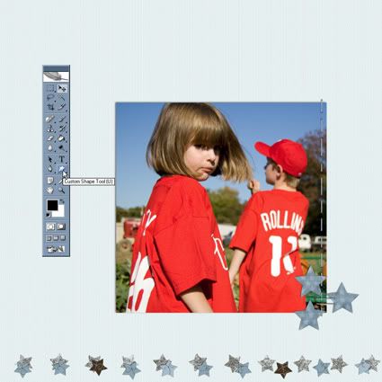
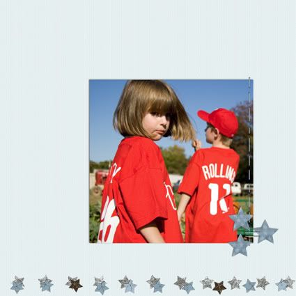
Let's get started. This is the start of my layout.  Just a quirky picture of my daughter, using my Precious page kit available, for free, right here in the freebie section!

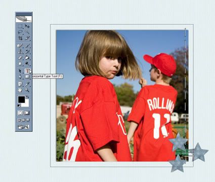
First thing we want to do is click on the Custom Shape Tool to get started.  What I'm going to do is draw a square around the photo and add text.

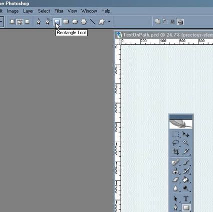
I'm going to choose the Rectangle Tool.

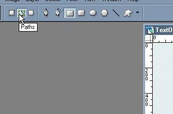
And make sure that box "Paths" is clicked.

Ok, I'm ready to go!

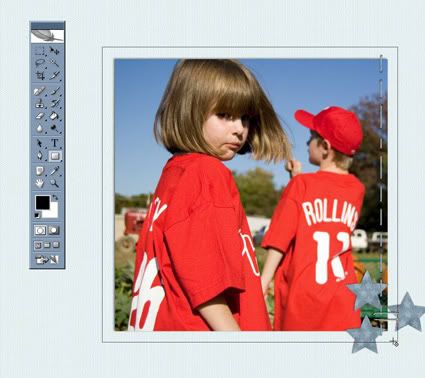
The next step is to draw the path around my photo. 
(I want a square so I hold the shift key down while I click and drag out the path.  That keeps it square.)

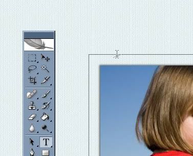
The next step is to click on the Text Tool.

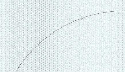
And here's the tricky part. I then want to place my cursor on the text path.  I want it to look just like it does below.  The cursor with the wavy line through the middle.  (I'll show you below another way to work with text on a path.)

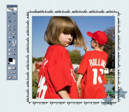
When I get that line, I just start typing! I chose one of my favorite fonts, violation, to reflect the attitude she's giving me.  You can type whatever you want, but I just chose to repeat the word over and over.

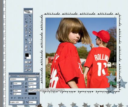
As you can see above, the word, attitude, is breaking a bit funny over the top left corner.  It bugs me.  I don't care as much about the bottom, but I like the top corners to look clean.  So, I highlight the text.  Then I'll start to futz with it (and I believe futz is the technical term).

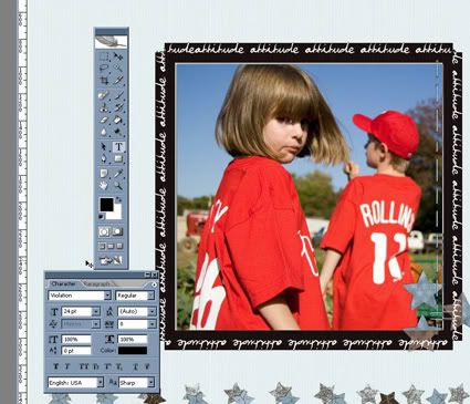
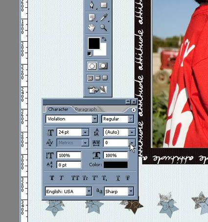
I'm going to futz with the kerning.  With the text highlighted, I open the character tool bar and go the kerning box.  That's the little AV with the horizontal arrow.  Kerning is the spacing between the characters.

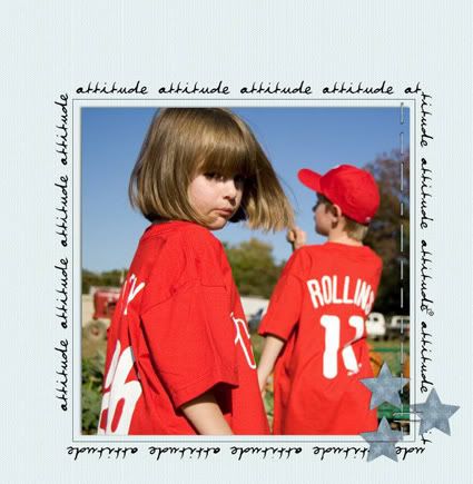
I finally got something I liked where the top corners look ok to me.  Not perfect.  But they aren't bugging me anymore!

This is what I got.

I'm going to add an inner border of a dotted line.  And I'll show you a little trick to get that close to perfect.

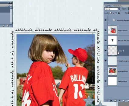
First, I repeat the steps above to draw out a square box path a bit smaller than my text.  I also add a new layer.

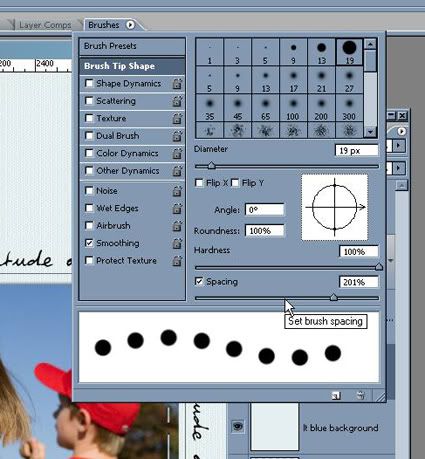
Then I choose a small round brush and set the spacing to something that looks like it'll work for me.

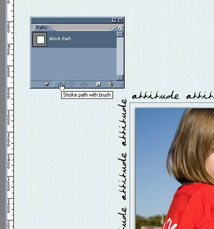
Then I go over to my paths toolbar and click on stroke path with brush.  (Be sure you are on your new layer!)

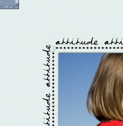
And of course, I didn't get a good screen shot of it BUT, the dots were overlapping in the upper corner.  Two of them were all squished together and it didn't look good at all.  So, I simply erased the offending dots.


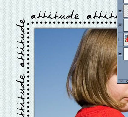
Then, I simply took my brush, same settings as when I stroked the path, and eye-balled one to fit in nicely.

This is an especially helpful technique when drawing a curvy path of beads.  There is always a place on the curvy path where the dots get too squished and even touch.  Which does NOT look good when you add the effects to make them beads.  Simply erase the dots that aren't right and eyeball one into the right place.

Ok, this is getting to be quite a long tutorial but I want to show you one more thing if you are new to paths and text.

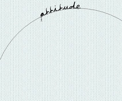
Let's say you are drawing out a circle.  You want the text to follow along the outside of the circle. This is what you want when you click on Text and hover your curser on the path.  Just like I mentioned earlier, the cursor with the wavy line through the middle.

Click and type. That's going to give you this. The words along the outside of the circle.

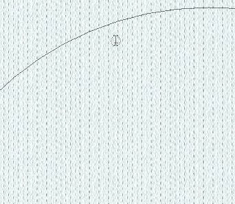
If your cursor looks like this, with a small dotted circle and on the inside of your shape like this.

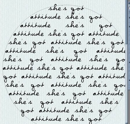
You'll get this when you click and type. Your text inside of the shape.

Two very different effects!!  But think of the possibilities!  Arrows, circles, squares . . . there are lots of pre-set shapes and you can use any of them and have the text either go along the outside or fill up the inside.

And, of course, you can draw your own shapes as well!  But I think that might be another tutorial!

I hope you learned a bit about paths and text and are ready to play and experiment and learn some more!!

If you do create something with this tutorial (or even of my tutorials or freebies) please link me up to your blog or layout so I can see it!!

Now, go, create . . . have fun!!

Wednesday, October 8, 2008

I Don't Iron {plus the Precious FREEBIE!}

{edited to include freebie info only}

Shall we move on to a new freebie??

It was inspired by a picture of my new nephew. And he is precious, hence the name of the new kit! It has five backgrounds, glitter stars (both small and big), cloth stars, small hanging tag, stitching, square mat, flower, beaded wire, great word art, and more!! And great colors that will showcase all sorts of memories in a beautiful way!

I sure hope you all enjoy it because I had a lot of fun making it!!

You can DOWNLOAD IT HERE!

Enjoy.

And if you use it to post online, credit:
Precious page kit by Beth Nixon available on her blog
(and list my blog address if you're allowed:
http://bethnixon.blogspot.com)

Thanks and have a great day!

(And I've added a secure paypal donate button to my blog over there on the right. As most of you, every spare dollar counts anymore. If you've enjoyed my designs or tutorials and have an extra dollar or two, I'd appreciate it! But I appreciate your comments on my blog even more!!)