Thursday, June 26, 2008

What's Better?? {plus Our Summer Template FREEBIE!}

{edited to include freebie info only}

And the perfect summer treat for my digi-scrapping readers is a FREE summer template!

This one has room for twelve photos with a fun sun background. And it's a fun 10" x 8" size which makes it perfect for framing and getting your layouts out of the computer and up on the wall for everyone to admire!

You can DOWNLOAD IT HERE!

I created the template in the hopes that I can instantly scrap my summer. Each month, choose my favorite four photos and on September 1st, print and throw in a frame. Instant review of our summer! But knowing me, I included the years 1998-2008! Because, ahem, I still haven't finished scrapping last summer! Please tell me I'm not alone in my delayed scrapping skills! Here's my layout using the template and last summer's photos!

Credit:
Our Summer Template by Beth Nixon available on her blog. And if allowed, please leave my blog address: http://bethnixon.blogspot.com

And, as always, leave me a comment if you like it. (then I'll know to make more!)

Enjoy the template and enjoy your Thursday!

Tuesday, June 24, 2008

Bethy's Tutorial: Word Art {with Word Art FREEBIE!}

I LOVE creating word art.  It's one of my favorite things to do and often my kits start with a piece of word art.

I'm certainly NOT an expert.  But I can pass on the three tips I have for creating stunning word art.

1) Fonts can be classified in about five different categories.  Yeah, that's not exactly true.  There are probably endless variations but it's a good place to start.

a) serif (note the small cross lines at the ends of the strokes)
fontSerif

b) sans-serif (notice the clean lines)
 
fontSansSerif

c) script (I also include handwritten fonts in this category)
fontScript

d) typewriter
fontTypewriter

e) and everything else! I just call it decorative
fontDecorative

Knowing fonts is ESSENTIAL to the next step.
And be sure to check the list at the end for a few sites to find fonts!

2) When you are combining different fonts, there are two fast and loose rules you should keep in mind. 

First, most times, only use 2 (or maybe 3) fonts in creating a word art or in a layout.  Sure, there are exceptions but most times using more fonts only makes the word art (or layout) look confused and without structure.

Second, when combining fonts, check out those five categories above.  ALWAYS combine fonts from DIFFERENT categories!  Yep, you want a contrast between your words.  (see the tutorial here for more on contrast) You do NOT want the difference so subtle that it's hard to see.  You want it to be obvious!  I *usually* combine a very low-key, straight-forward font (like Arial or Garamond) with a bold font (like Artistamp Medium or violation).  The bigger the difference, the more striking the word art will, usually, be.

3) And last . . . look at the phrase you are trying to create and emphasize part of it! (And don't be afraid of size!)

For example, let's use the phrase "so in love with you"

Do you mean:
"so IN LOVE with you"
or
"so in love with YOU"

See the difference?

Here are the two examples I created using the phrase above, emphasizing the different parts. (and yes, these are a fun freebie for you! The link is just below!)

Emphasizing different parts give word art different feels! 

So, play . . . try different fonts, sizes, combinations.  The tips I have above are NOT hard and fast rules. 

Here's my one and only rule when creating . . . if *YOU* like it, it's great!  It's when things don't look just right to you that you can look over some of the tips above or any of the basic design rules and start to play and tweak things to get it like *YOU* want!!

Ok, to spice up your word art and your layouts, you need fonts! LOTS of them!  Here are a few sites for free fonts:

http://www.dafont.com
http://www.fontfreak.com/index3.htm
http://www.abstractfonts.com

And here are a few where you can buy great fonts:

Creative Keepsakes
Suzanne Walker at Digital Scrapbook Place

Just remember, if you are creating for yourself, personal use, you can use these fonts anyway you like.  If you decide to share or sell anything, please make sure you have the commercial rights to do that!

And if you know a great font site, let me know and I'll add it to the list above!

Ok, here's the link to the two pieces of word art I featured above.  You can DOWNLOAD THEM HERE!

Enjoy!!

Sunday, June 22, 2008

A New Perspective {and Smile In My Heart FREEBIE!}

{edited to include freebie info only}

Ok, ok. Enough about ME! I know what you all really want . . . the super duper new freebie! This one was SO fun to make. The blues and greens with a pop of yellow and red will make just about any photo (and memory) shine! There are 11 unique png elements and five jpg backgrounds. Scalloped heart, big bracket, notepaper hearts, masking tape and much more!

I sure hope you enjoy it! You can see the layout I made with it here.

As always, please let me know if you like it! Give me a link if you use it so I can come ooh and ahh!
Credits are: Smile In My Heart by Beth Nixon
and if you're allowed, a link to my blog:
http://bethnixon.blogspot.com

DOWNLOAD IT HERE
(the link will be good until mid-July or so!)

Enjoy!

Have a great day!!

Friday, June 20, 2008

Bethy's Tutorial: Journaling as an Artistic Element (Part 3)

(Check out Parts 1 and 2)

Do you have just one line or a small paragraph? Can it echo the lines of your layout? Border it? Follow the photo? If you have one line of long text, you can almost treat it like a ribbon, snaking across your layout.

Jill borders her picture here with her journaling. By framing the photo with her journaling, it becomes an artistic part of it. Your eye stays right on Keith!


It's just a list of Chris's favorite books but by using that list to border the layout, Tara compliments the horizontal straight lines at the bottom.


The length of the journaling, the emotion of the journaling, the importance of the readability, are all things to consider and can help you determine what sort of "element" your journaling will become.

Just remember, journaling is part of you. There is no right or wrong. Get the words down and the rest will flow from there!

Here are a few other examples . . . 
journalingMommy
(Mee Maw by Elizabeth Weaver, layout by Beth Nixon)


(Corgi Lover)


(Corgi Lover)

journalingMyKatie  
(BethyNixon)


(OrangeSue)

journalingTimeOut  
(BethyNixon)

 
(MaureenH)


(Sharon1313)

 21
(Meg)

End of Part 3

*note: for credits and full-size looks at most of the layouts, click to see them in the user's gallery at DSP.

Bethy's Tutorial: Journaling as an Artistic Element (Part 2)

(Check out Part 1 HERE)

Is the journaling short and to the point? Then you might need just a small area or a tag. Keep that small space in mind when you are placing your elements. Where could you tuck it in to continue good design concepts and keep it an essential part of your layout?

This layout by Sharon is a good example. She knew she wanted to include the lyrics. It didn't need a lot of room, but by using the rule of thirds and putting her photo and her delicious garden on the left, she left a column, just big enough for her lyrics. And by changing the background behind the words, it weights it just a bit to the right, balancing those heavy flowers with her lyric section.

05

Or this one by Jenni (willjenni). She needed room for here title and her few lines of journaling. But didn't want to take the focus off the simply heart warming photo. By concentrating on where the focal part of the layout lays, on the left, and blending beautifully the right side, she was able to find a perfect place to put the journaling.

06

Here's another one by Chris (gundimom) that is the perfect artistic placement of just a little text. Her text mirrors the long line of the pole and emphasizes the story she is trying to tell in her layout.


What about fonts?

For long journaling, keep it simple. Clean, read-able. For shorter sections or big fonts, get crazy!! This is one of my favorite layouts. The layout was conceived with the journaling, the tape, and the fonts in mind. It was about both the photo and the journaling. They words had to be their own element to emphasize the story behind the package.

journalingTape
(elements of Stacey Jewel Stahl)

And this one by Julia (webfrau). By using so many fonts she emphasizes the story she's telling. It's no longer just the words. The visual impact of the journaling tells the story as well.


End of Part 2
(
see Part 3)

*note: for credits and full-size looks at the layouts, click to see them in the user's gallery at DSP.

Bethy's Tutorial: Journaling as an Artistic Element (Part 1)

Let's talk a little about journaling. And journaling NOT as an after thought and not put on a layout in a boring block, but journaling that's an artistic part of your layout! But, first, why journal at all?? I mean besides a name and date, why do we journal?? The power of scrapbooking IS journaling. We are putting together both the photo and the words in an artistic way so that we'll always remember the moment, exactly how we want. And, let's face it. Who is the most forgotten person in scrapbooking? US, the scrapper!! The first layout I want to show you is for the journaling. It reminds me perfectly WHY we need to journal. It's our way of being in the layout! This by one of my most favorite scrappers. Not just for her fantastic photos and her utterly fantastic compositions, but for her words.

Here's what Meg has to say about journaling in her layout:

Me. The person behind the camera (most of the time). You won't find many pictures of my face. But read the words. You'll hear me. See the smiles on your faces. You're reflecting the one on mine. Know that I created these pages out of love for you.

01

Ok . . . so how do we start making the journaling MORE then just an after thought or something we slap in the corner?

Start with the journaling! The story you want to tell. It doesn't have to be long, it doesn't have to be written to perfection. It just has to say what you want to say about the memory you are recording. Then think how that fits in your layout.

Is your journaling happy and hopeful and long? Then your kit might be bold and full of patterns and you will need a vellum or a plain mat to fit your journaling. When you are choosing your elements, pull an appropriate size piece into your canvas or keep an area for it.

Sharon's layout here is bright with a nice long section of journaling but the way she's blocked it out, the journaling flows beautifully and becomes part of the design. She has her swirly elements clear of the text and the patterns are on the borders so they don't clutter up the text.
  
This one by Ann (isshinryu_mom) is FILLED with text. But she carefully chose a background that wouldn't distract from her text and had it flow around her cluster of elements. There's a lot of text. That's definitely a design challenge. And Ann made the text part of her design concept. If it had been an after thought, it might have been more stilted. Instead it's an intrinsic part of the design.

  
Or this one by Jill (momof1chef). Lots of text, patterned papers, elements, curves. And she placed everything knowing she would need the room to journal. That by clustering it all to one side, by using a plain background, she could journal her whole story.

  
One thing to keep in mind, for most layouts, 12x12 is too long to read. What do I mean? Many lines of text that are 12 inches long become hard on the reader's eyes. With both Ann's and Jill's layouts, those long 12 inch lines only make up a small portion of the layout. Most of the text lines are shorter in length. If you do have lots of text, try a column approach.

And if you have LOTS of journaling? Is it a story that will dominate the page? Then you want to concentrate on readability. Font choice - a serif - not too bold.

End of Part 1
(
Part 2 and Part 3)

*note: for credits and full-size looks at the layouts, click to see them in the user's gallery at DSP.

Monday, June 16, 2008

Tiny {and Lined Up Template FREEBIE}

{edited to include freebie info only}

I have another freebie ready for you! This one is a template framer, Lined Up.

What's a Framer? Well, it's my term for a 10" x 8" layout. The PERFECT size for quick and easy gifts! Or art on your wall! Frames are easy to find for that size and you can print them right on your own printer! Art on your wall, or for a gift, in a matter of minutes!

DOWNLOAD IT HERE!! Then, please, leave a comment if you like it, leave me a link if you use it, or click an ad if it catches your eye!

Credit, if posting on a digi-scrap site, Lined Up Template by Beth Nixon and mention my blog (http://bethnixon.blogspot.com) if you're allowed!

And check back later this week! I have a fun give away planned for your favorite digital scrapbook site or amazon.com! Plus I'm hoping to find the time to not only finish up another kit but also finish up a journaling tutorial!

Then check out my latest post, A Mother's Advice and check out the contest (June 18-19)!

Sunday, June 15, 2008

Bethy's Tip for Color! {digi-scrap designers}

I've been creating digital scrapbook product for almost two years.  And one thing that I sometimes struggle with is finding beautiful and unique color schemes.

Well, I'm going to let you in on one of my secrets . . . many of you may already know this . . . but for those that struggle with color, check out kuler.adobe.com.

There are hundreds of schemes that you can search for by key word.  Plus there's a option to create your own that is super fun to play with!

I'll search by a emotion, season, or just a general idea and I'm always blown away AND inspired by what comes up!  For example, I had an idea for a kit that was going to be about love.  And I wanted a summer-time feeling to it.  So I searched for "summer love".

This is what I found:
color

I just LOVE the colors in this and it just inspired me!  Usually paging through different searches gets me all sorts of inspiration!  I have all sorts of files saved for future inspirations!

Just remember the "gallon, quart, pint" rule when designing.  Choose a major color (or set of colors).  Design a "gallon" of your product with that color.  Then pick one to be the quart (something to compliment but not overwhelm) and then a "pint." That would be a highlight color.  That gives your kit a cohesive feel.

Other color sites I've found to be useful are:

I also check out wallpaper sites!  Those also give you ideas for patterns.  Just be sure not to copy, just get inspired.  We don't want anyone to violate copyright laws!

Hope the next time you get stuck for color inspiration, this helps!

Tuesday, June 10, 2008

I'm Thankful and the Sweet Summer FREEBIE!

{edited to include freebie info only}

Now, snatch up the freebie down below. Leave me a comment here if you have a moment and you like the freebie. (And please do! If I know you all like these, I'll keep making more!!).

Ok, here's the kit, Sweet Summer. You can DOWNLOAD IT HERE! You can see a layout I did with it here.

As always, if you post, just credit Sweet Summer by Beth Nixon and list my blog address if allowed! http://bethnixon.blogspot.com

Thanks and enjoy!

P.S.
Grab my other freebies while you're here.
Love Life and Ordinary Joy page kits are going away tomorrow. Grab them quick if you don't already have them.

The 19 Circles Template will only be up for another week.

Oh So Happy page kit will be up until mid-June!

Have fun with them!

Thursday, June 5, 2008

Bad Leopard {and a Template FREEBIE!}

{edited to include freebie info only}

Ok, it's time for another freebie! This one is a template that I've been meaning to put together for a long time and I finally found the time to get it done!

The template was inspired by this layout of little boy at the circus. And what's great about this template is you can utilize not only LOTS of pictures and memorialize an entire event in one layout, but you can use some really lousy pictures! The pictures I took here were AWFUL. But I was able to crop just the parts I wanted and they didn't look half bad!

Here's the finished template.

You can DOWNLOAD IT HERE!

Enjoy!
(and, as always, I'd love it if you'd leave a comment if you like the freebie or click on an ad if it catches your eye!!)

Have a GREAT Thursday and I'll see y'all soon!

Sunday, June 1, 2008

About Me!

Welcome to my blog! I'm Beth. A mom, a wife, and a learning photographer, knitter, and whatever else catches my eye!

Just like all moms, I'm finding that the time goes by WAY too fast. And some days I feel like I get so wrapped up in the utter nonsense that I'm missing the best parts. I'm doing my absolute best to enjoy every second of it. But somedays . . . well . . . it's just hard.

So, I'm doing my best. My best to find the joy in every day and to choose happy over all the other alternatives. Sure, there are hard times and bad times. But I want to remember how I got through them, not how they defeated me.

Here you will find my musings as I try to find that joy and happiness. Even when it's tough. Also a few digital scrapbook freebies as I have time to create them, some tutorials on design and general Photoshop tips, some knitting, an occasional contest, and the rest of my blatherings.

Feel free to comment and give me suggestions! I love your stories and opinions. It's what brings me back to the computer to blog and to create new freebies.

Come back often or, better yet, sign up for a reader and you'll know as soon as I update!

Thanks and take care!

Thanks for stopping by!

Digital Scrapbook Freebies!

Yep, that's right! Freebies for digital scrapbook right here!

Here are the freebies I've put together to share with my blog readers. If you use any of them, please credit the product to Beth Nixon available on her blog (and list my blog address if allowed; http://bethnixon.blogspot.com).

I create at 300 dpi.  My product is big enough to create a wide variety of layouts but small enough so they won't overwhelm your hard drive!  I aim for about 5 backgrounds and 11 unique png elements per page kit.  I include shadows on some items to create that extra touch of realism. Everything is digitally created and is available for personal use only.  Please feel free to share the link to my blog to anyone who may be interested but don't share the product zip files directly!

If you create a layout, please come back and let me know! Leave a comment if you like the freebies!

Freebies

Remember to check back often!

Thank Goodness for Photoshop!

As I mentioned last week, I finally got myself a new DSLR camera, a Nikon D40. And it's the best toy I've gotten since I was about nine-years old! Since last Saturday, I've taken way over 1,000 pictures.

So, my first thought . . . HOW did anyone learn the intricacies of a SLR camera before digital? It just had to be out of the reach of most people. Can you imagine trying to learn something as complicated as balancing aperture, shutter speed, ISO, and exposure with film? Waiting and paying for development of film to find out your mistakes?

Heck, I must have blown through 100 pictures just sitting in a chair, taking photos of the sprinkler at different shutter speeds. I took entire series of pictures of the same object, just noting and changing a setting at a time. Then studied the photos to see what it all mean to the finished photo.

Then? I just deleted them all. Sure, I've kept a few of my favorite photos. But most were just deleted.

Anyway, I was practicing yesterday, just on my own toes, inside on a rainy day. I'm not happy with many indoor pictures yet so I was messing with ISO and exposure trying to see what happens.

Then it stopped raining. But it was still quite dark and cloudy out. I had promised the kids they could go stomping in rain puddles, so, off we went, me with my camera, to go stomping in puddles.

The shutter speed just wasn't going to be fast enough to capture them jumping and the puddles splattering about. So I futzed with things. Things I *thought* I had learned when practicing on my rainy-day toes. Things I shouldn't have futzed with as I came home with about 200 REALLY lousy pictures. Bad. And such cute moments that I was really ticked that I didn't notice how bad the photos were on the camera. I thought they were ok until I came home and pulled them up in Photoshop.

But I had to try to save them. Here's what I did to try to save them.

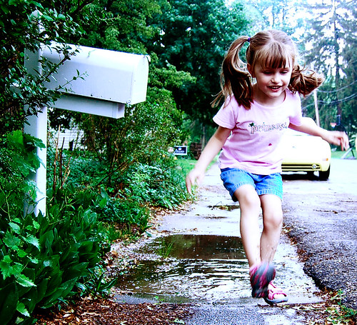
Here's the original, straight-out-of-the-camera picture.

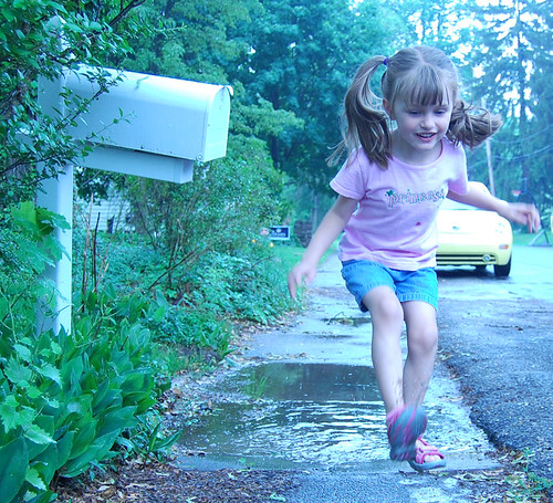
Isn't that cute! But awful at the same time! I just love her face and the mailbox and the green but good golly did I mess up the exposure on this one!

So, being the Photoshop kinda girl I am, I set off to see if I could fix it.

First thing I did was add an adjustment layer for the levels. This just boosted the contrast. Made it look less soft. I color picked a black from the photo and then moved the sliders, on both sides, in a bit.

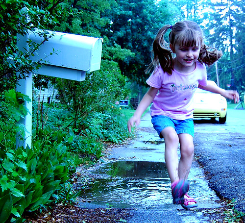
Next up was an adjustment level for color. Cause look how blue that photo looks. So I added yellow and red and took a bit of green away.

Better. But no matter of adjustment is really going to make this look true. It's just too off. And as this was a cloudy day. And we're stomping in puddles on a dirty sidewalk, I decided a more grungy, urban feel would work.

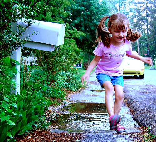
So, I made a copy of the original photo and moved it to the very top of my two adjustment levels. Just using the standard settings in Photoshop, I desaturated it to B&W. Then I took the layer mode and set it to Hard Light.

There. That's better. But I still wanted a bit more. So I duplicated that Hard Light layer. Changed it to Soft Light and took the opacity down just a bit.

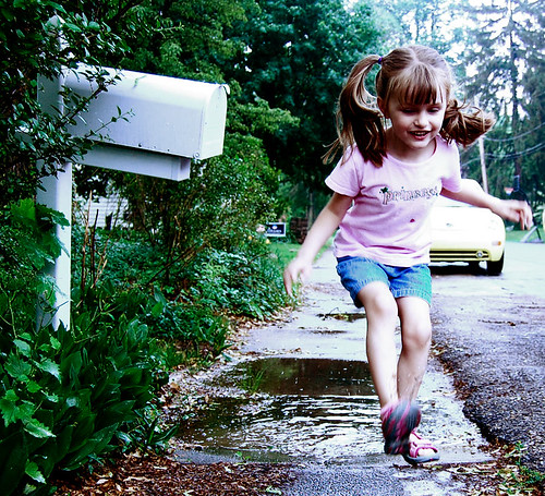
It doesn't look a heck of a lot different here, but on my screen, it added just a bit more pop with the contrast.

The final step, I merged all the layers and sharpened. Just to define things a bit more.

So from a big mess-up in the camera to an artistic looking fix in Photoshop.

You can see the whole series, all in a nice neat slideshow, at my page on Flickr.com, here.

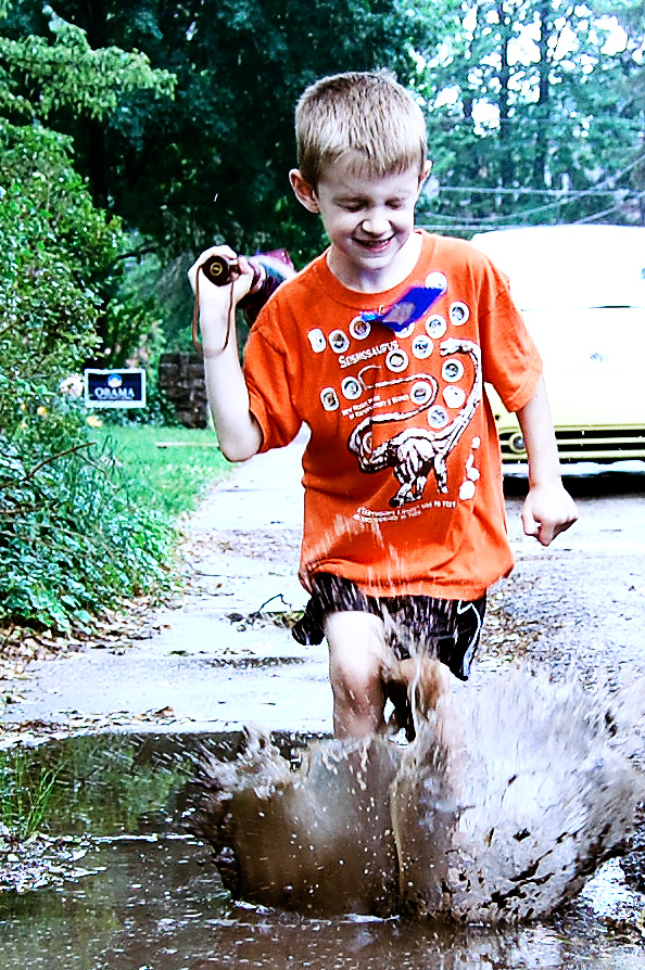
And here's a picture of little boy that I did with practically the same process.

I'll I can say is THANK GOODNESS for Photoshop for nitwits like me!! And now? Now I'm off to read that manual a bit closer to see if I can get it right from the start next time!

Thanks for reading and enjoy your Sunday!