Want to know how to get your text to go around your photo or follow a shape? Here's a quick, down and dirty, tutorial to get you comfortable with it and ready to experiment with all sorts of things!
I use Photoshop CS2. All screenshots are from that. I'm not sure how to do things in other programs but this may give you a place to start playing!
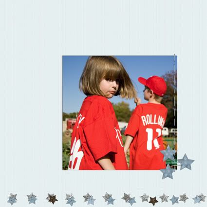
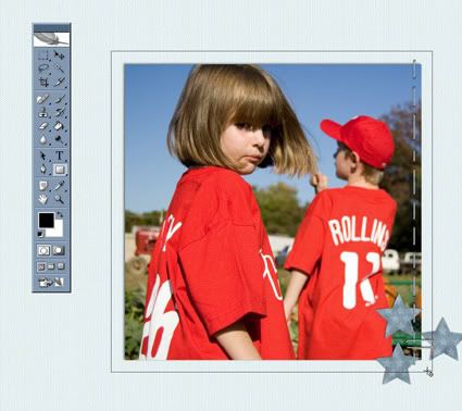
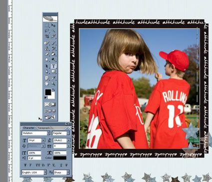
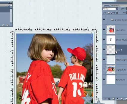
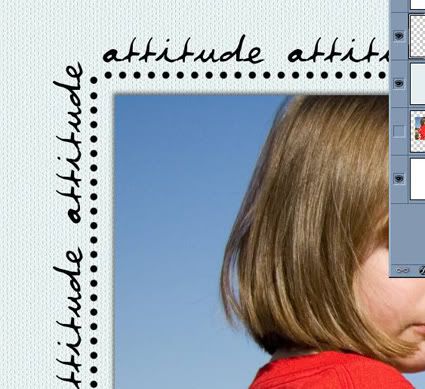
Let's get started. This is the start of my layout. Just a quirky picture of my daughter, using my Precious page kit available, for free, right here in the freebie section!
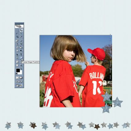
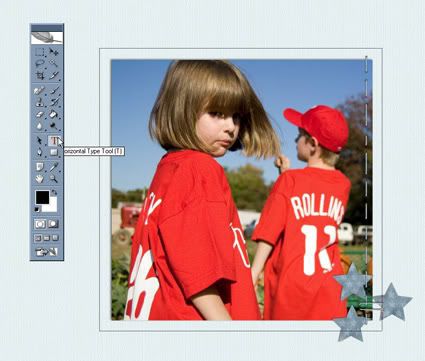
First thing we want to do is click on the Custom Shape Tool to get started. What I'm going to do is draw a square around the photo and add text.
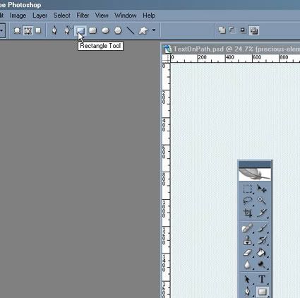
I'm going to choose the Rectangle Tool.
And make sure that box "Paths" is clicked.
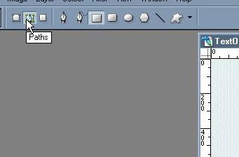
Ok, I'm ready to go!
The next step is to draw the path around my photo.
(I want a square so I hold the shift key down while I click and drag out the path. That keeps it square.)
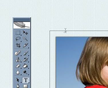
The next step is to click on the Text Tool.
And here's the tricky part. I then want to place my cursor on the text path. I want it to look just like it does below. The cursor with the wavy line through the middle. (I'll show you below another way to work with text on a path.)
When I get that line, I just start typing! I chose one of my favorite fonts, violation, to reflect the attitude she's giving me. You can type whatever you want, but I just chose to repeat the word over and over.
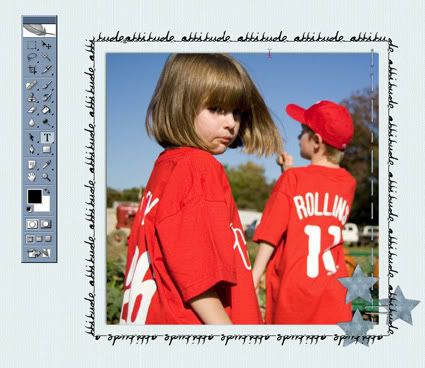
As you can see above, the word, attitude, is breaking a bit funny over the top left corner. It bugs me. I don't care as much about the bottom, but I like the top corners to look clean. So, I highlight the text. Then I'll start to futz with it (and I believe futz is the technical term).
I'm going to futz with the kerning. With the text highlighted, I open the character tool bar and go the kerning box. That's the little AV with the horizontal arrow. Kerning is the spacing between the characters.
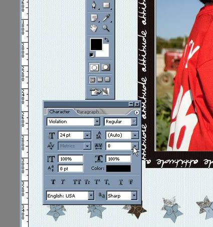
I finally got something I liked where the top corners look ok to me. Not perfect. But they aren't bugging me anymore!
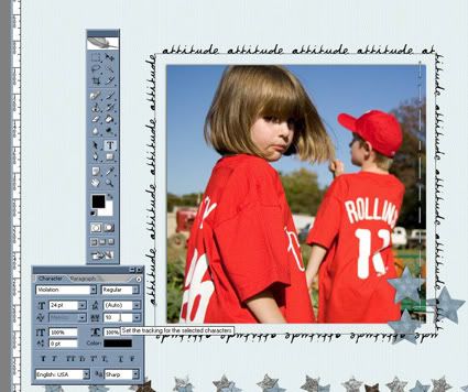
This is what I got.
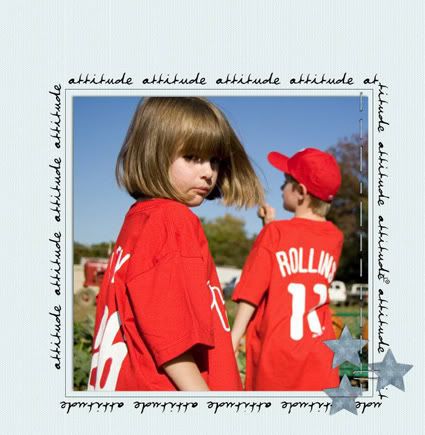
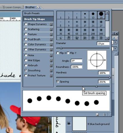
I'm going to add an inner border of a dotted line. And I'll show you a little trick to get that close to perfect.
First, I repeat the steps above to draw out a square box path a bit smaller than my text. I also add a new layer.
Then I choose a small round brush and set the spacing to something that looks like it'll work for me.
Then I go over to my paths toolbar and click on stroke path with brush. (Be sure you are on your new layer!)
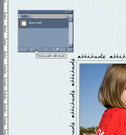
And of course, I didn't get a good screen shot of it BUT, the dots were overlapping in the upper corner. Two of them were all squished together and it didn't look good at all. So, I simply erased the offending dots.
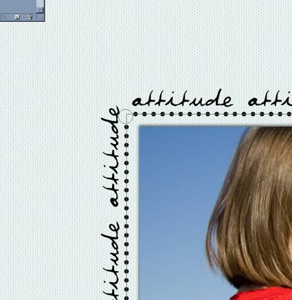
Then, I simply took my brush, same settings as when I stroked the path, and eye-balled one to fit in nicely.
This is an especially helpful technique when drawing a curvy path of beads. There is always a place on the curvy path where the dots get too squished and even touch. Which does NOT look good when you add the effects to make them beads. Simply erase the dots that aren't right and eyeball one into the right place.
Ok, this is getting to be quite a long tutorial but I want to show you one more thing if you are new to paths and text.
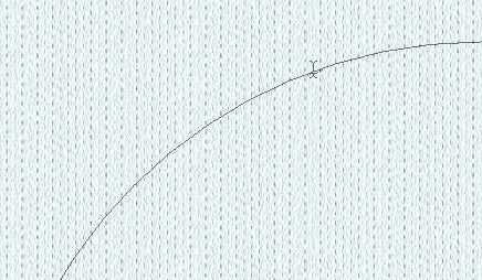
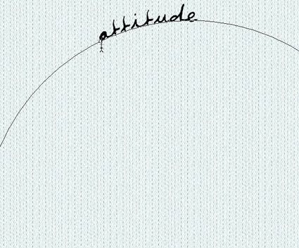
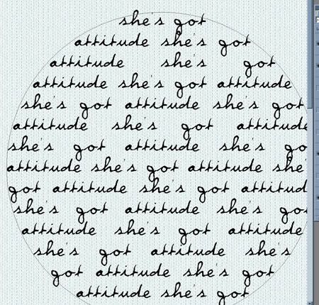
Let's say you are drawing out a circle. You want the text to follow along the outside of the circle. This is what you want when you click on Text and hover your curser on the path. Just like I mentioned earlier, the cursor with the wavy line through the middle.
Click and type. That's going to give you this. The words along the outside of the circle.
If your cursor looks like this, with a small dotted circle and on the inside of your shape like this.
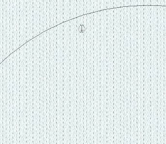
You'll get this when you click and type. Your text inside of the shape.
Two very different effects!! But think of the possibilities! Arrows, circles, squares . . . there are lots of pre-set shapes and you can use any of them and have the text either go along the outside or fill up the inside.
And, of course, you can draw your own shapes as well! But I think that might be another tutorial!
I hope you learned a bit about paths and text and are ready to play and experiment and learn some more!!
If you do create something with this tutorial (or even of my tutorials or freebies) please link me up to your blog or layout so I can see it!!
Now, go, create . . . have fun!!

4 comments:
Very cool Beth! I'm printing this tutorial out to try!!! Thanks so much.
TY! Love your tuts! May I post a request for a tut? If so, I have been searching it seems forever for a tut on how to make a frame using those cute little bead, or heart type elements in a circular format and scallop edging. I am glad to see you searching for a new store! Good luck!
Thanks so much for this, Beth! It's so cool!
For the record, I tried it in Photoshop CS - It works well in the older version too! :)
Thanks so much for these wonderful tutorials. I am new to digi scrapping and PS...these certainly make it easy for me to try new techniques!
Post a Comment