I LOVE creating word art. It's one of my favorite things to do and often my kits start with a piece of word art.
I'm certainly NOT an expert. But I can pass on the three tips I have for creating stunning word art.
1) Fonts can be classified in about five different categories. Yeah, that's not exactly true. There are probably endless variations but it's a good place to start.
a) serif (note the small cross lines at the ends of the strokes)

b) sans-serif (notice the clean lines)

c) script (I also include handwritten fonts in this category)

d) typewriter

e) and everything else! I just call it decorative


Knowing fonts is ESSENTIAL to the next step.
And be sure to check the list at the end for a few sites to find fonts!
2) When you are combining different fonts, there are two fast and loose rules you should keep in mind.
First, most times, only use 2 (or maybe 3) fonts in creating a word art or in a layout. Sure, there are exceptions but most times using more fonts only makes the word art (or layout) look confused and without structure.
Second, when combining fonts, check out those five categories above. ALWAYS combine fonts from DIFFERENT categories! Yep, you want a contrast between your words. (see the tutorial here for more on contrast) You do NOT want the difference so subtle that it's hard to see. You want it to be obvious! I *usually* combine a very low-key, straight-forward font (like Arial or Garamond) with a bold font (like Artistamp Medium or violation). The bigger the difference, the more striking the word art will, usually, be.
3) And last . . . look at the phrase you are trying to create and emphasize part of it! (And don't be afraid of size!)
For example, let's use the phrase "so in love with you"
Do you mean:
"so IN LOVE with you"
or
"so in love with YOU"
See the difference?
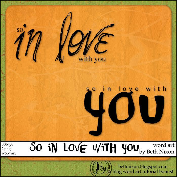
Here are the two examples I created using the phrase above, emphasizing the different parts. (and yes, these are a fun freebie for you! The link is just below!) 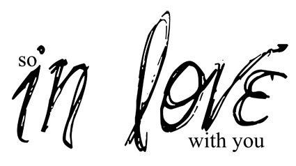
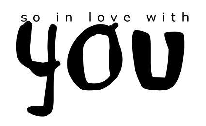
Emphasizing different parts give word art different feels!
So, play . . . try different fonts, sizes, combinations. The tips I have above are NOT hard and fast rules.
Here's my one and only rule when creating . . . if *YOU* like it, it's great! It's when things don't look just right to you that you can look over some of the tips above or any of the basic design rules and start to play and tweak things to get it like *YOU* want!!
Ok, to spice up your word art and your layouts, you need fonts! LOTS of them! Here are a few sites for free fonts:
http://www.dafont.com
http://www.fontfreak.com/index3.htm
http://www.abstractfonts.com
And here are a few where you can buy great fonts:
Creative Keepsakes
Suzanne Walker at Digital Scrapbook Place
Just remember, if you are creating for yourself, personal use, you can use these fonts anyway you like. If you decide to share or sell anything, please make sure you have the commercial rights to do that!
And if you know a great font site, let me know and I'll add it to the list above!
Ok, here's the link to the two pieces of word art I featured above. You can DOWNLOAD THEM HERE!
Enjoy!!

2 comments:
Thanks so much for these tips, Beth! I am venturing our of my comfort zone and trying new wort art things with fonts. Using more than one font n a phrase is very foreign to me! I'm going to use your guidance in continuing to learn! :)
Thanks for a great tutorial. I really appreciate your summary of 5 types of fonts - very helpful.
Post a Comment